
Using Art To Create Your Design Aesthetic
- Krista Collard

- Sep 26, 2020
- 3 min read
Updated: Oct 2, 2020

Image Source | Kelly Deck
If you’re unsure where to start with your home decor, using a piece of artwork as the focal point can be an excellent way to begin designing your room. With artists doing all the hard work of colour theory for you, drawing your room’s colours and styles from a statement art piece can create a cohesive, stylish design that you’re sure to love. Here’s our guide on how to use art to create your design aesthetic.
Use your artwork as the basis of your colour palette

Image Source | Brittany Ambridge
Are you drawn to certain colours but aren’t sure how to use them in a complementary colour palette? Picking an artwork that you really love and then drawing the colours out of it for your room’s theme can be a great way to create a balanced, cohesive look to your room. Don’t feel like you need to choose art with your usual colour choices either - go with your gut on your favourite piece and let it do the work for you.

Image Source | Kirsten Jackson
If your chosen artwork features lots of different colours, be careful not to go overboard in your colour choices. Pulling one or two complementary colours will help form the foundation of your palette without becoming messy or confusing. Pulling out a style wheel can be a great way to make sure your palette goes well together and you don’t pick colours that clash.
Incorporate neutrals to break up the colours

Image Source | With Love From Kat
Anyone that’s read my blogs for a while will know I’m a huge fan of neutral colours. While too much white and black can become stark, using them as a base combined with your chosen colours is the best way to make a room ‘pop’. I personally love using taupe or beige in my decor, which looks especially elegant paired with deep tones such as emerald green, or can become modern and fun with lighter tones like blush and turquoise.

Image Source | Framebridge
For an added touch of sophistication, consider adding metallics like gold, brass, copper or silver into your palette. These work particularly well when paired with either subtle creams or deep colours such as dark grey and navy. Again, don’t succumb to shiny object syndrome and go too overboard - a few statement items such as book ends or metallic fixtures in lights and shelving can draw the eye without looking overbearing.
Juxtaposition is your friend

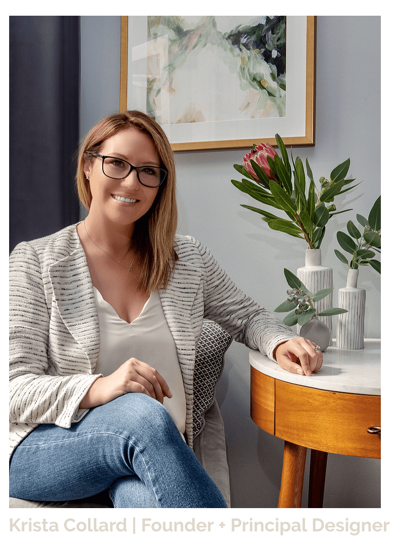
Image Source | Krista Collard
Ever heard the phrase ‘green and blue should not be seen, without a colour in between’? While you might be tempted to use only colours from the same side of the colour wheel, getting too matchy-matchy can actually hinder the look of your room. Instead, consider choosing a few pieces of decor in a contrasting colour to add dimension to your palette and room.

Image Source | The Design Files
The same can be said for the style of your pieces. Follow the rules of style pairings to ensure your pieces go well together - so if your artwork is traditional, maybe use similar tones in your rugs and cushions, but make those patterns a bit more modern and streamlined. Remember also that lines and dots juxtapose nicely together, so if you have an abstract painting with a lot of clean lines you might like to pair it with a more traditional rug.
Do you have a statement piece you want to showcase, but need help with the rest of your design? Contact me today to discuss your aesthetic and together we can design the best room for you!
Krista Collard Interiors is a full service design-build firm focusing on creating timeless spaces that honour sustainability and functionality across the Greater Sydney area.
Ready to transform your home? Get started by booking a complimentary Discovery Call with us!


Comments